A green-glow storefront
Same wordmark, scaled up to a real signage — neon-green INK ROOM glowing through the window of the studio. The IR mark pinned beside the door, the door itself outlined in lime — the brand's surgical silence at city scale.
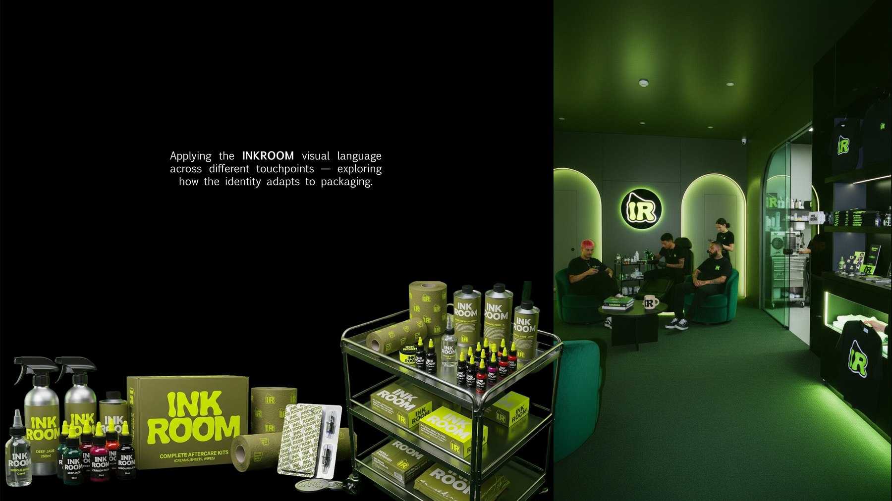
A full visual identity, 3D + motion system, packaging and social language for a tattoo studio that wanted to feel surgical rather than rebellious — steel · skin · silence.
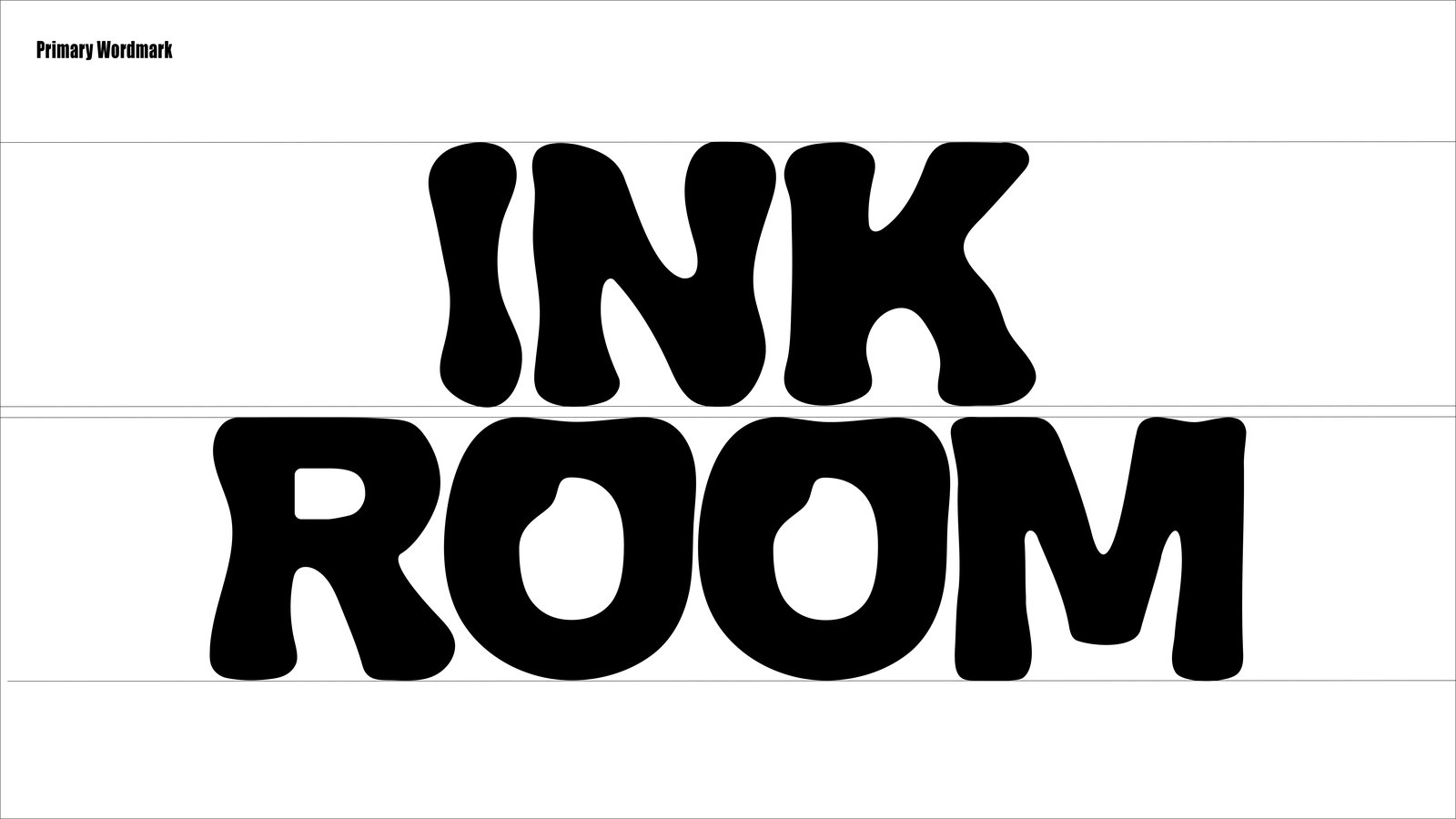
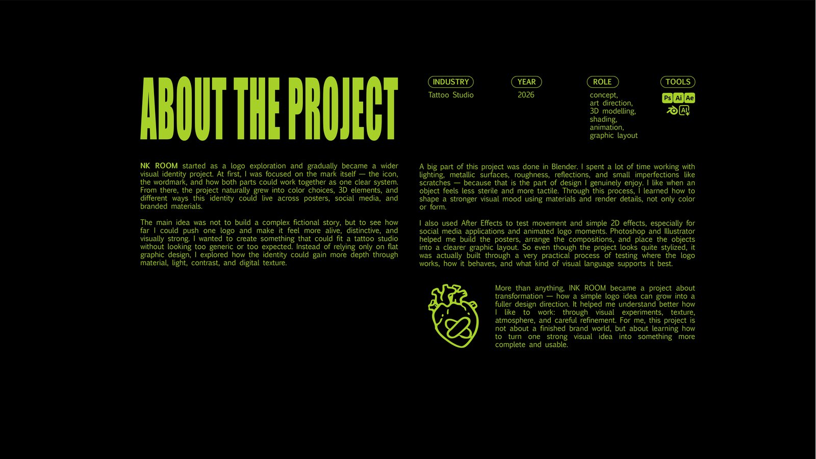
InkRoom started as a logo exploration and gradually became a wider visual identity project. The focus shifted to the wordmark — the icon — and how both parts could work together as one clean system.
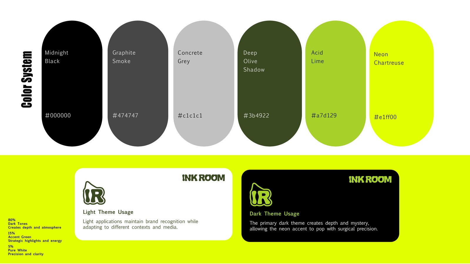
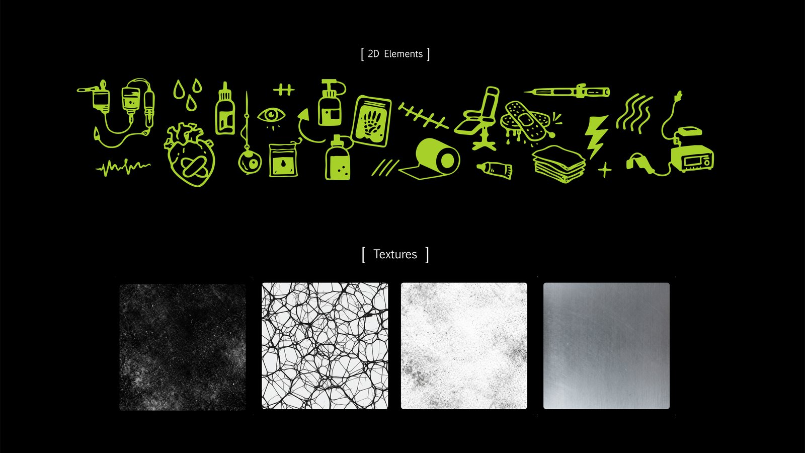
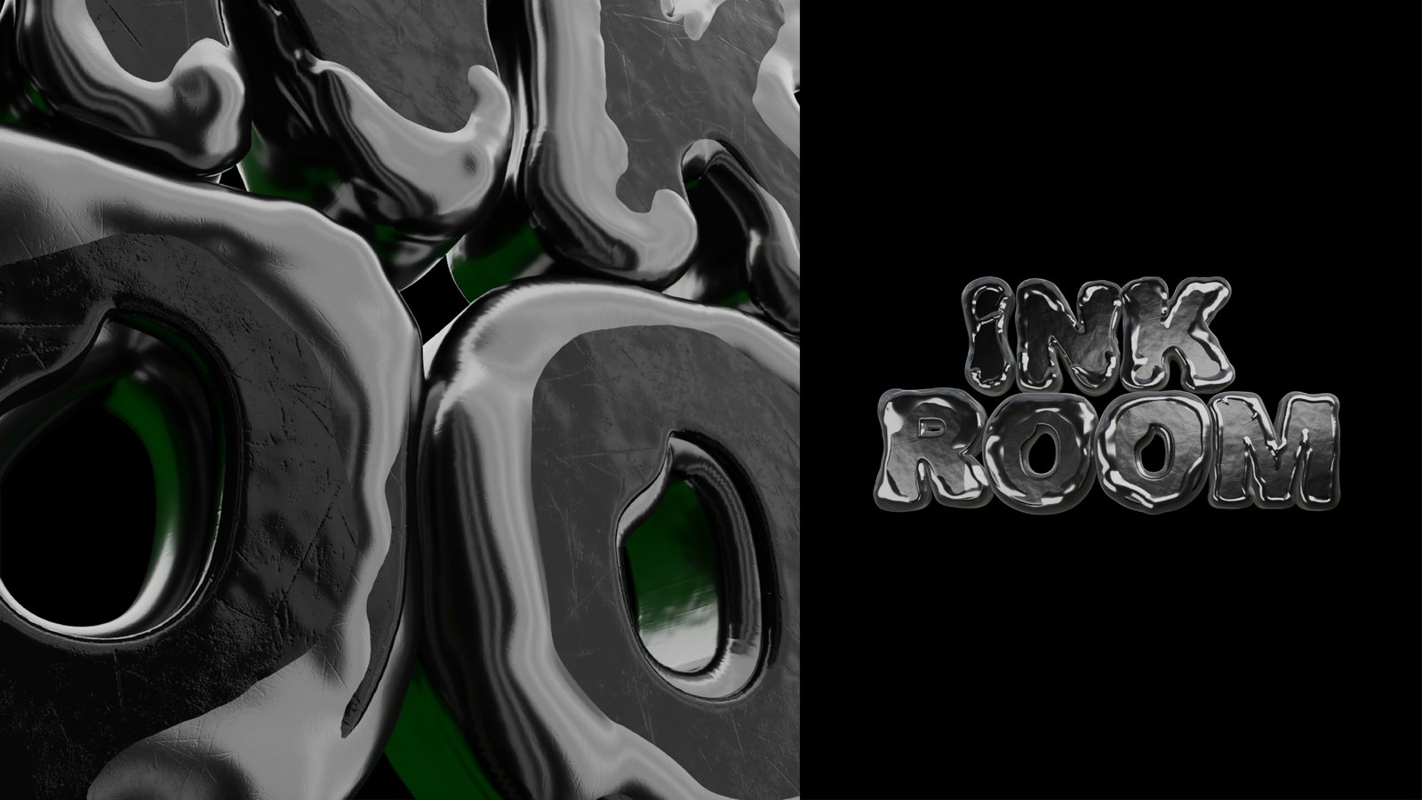
The naming — steel · skin · silence — sets the temperature: cold and surgical. The primary palette is Midnight Black + Acid Lime; the rest of the system is metallic surfaces, roughness, reflections and small imperfections — scratches, because this is the part of design I genuinely enjoy. Like when an object feels less sterile and more tactile.
Built in Blender for 3D, then composed in After Effects for motion and simple 2D effects — used for social-media applications and animated logo moments. Photoshop and Illustrator stitched it together as graphic layout.
Three small motion pieces show the brand alive: the wordmark and the IR mark in light/dark themes, the family of 3D elements (machines, ink drops), and the inflated logo with floating black drops.
A small chrome character — the studio's visual signature, a guardian of the brand.
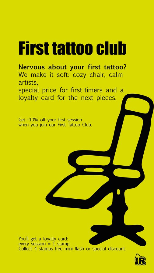
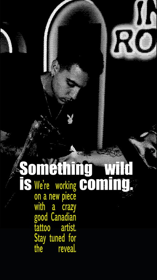
The same identity at story-format scale: bold typography, the IR mark as a stamp, and the colour system doing the heavy lifting.
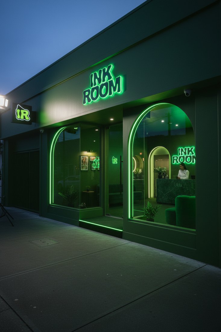
Same wordmark, scaled up to a real signage — neon-green INK ROOM glowing through the window of the studio. The IR mark pinned beside the door, the door itself outlined in lime — the brand's surgical silence at city scale.
Keep exploring — open another case, or step into the experiments drawer.